How to Reduce Image File Size for Websites
Images are usually the heaviest part of a web page. A single unoptimized photo straight from a phone or camera can weigh more than all of a page's text, code, and styles combined. The good news is that image weight is also one of the easiest things to fix, and you don't need special software to do it. This guide walks through a simple workflow: get the dimensions right, pick a sensible format, compress carefully, and serve the result in a way browsers can load efficiently.
Why image size matters
Large images slow pages down, especially on mobile connections. That affects how visitors experience your site, and it also shows up in Core Web Vitals, the set of user-experience measurements Google uses as part of its page experience signals:
- Largest Contentful Paint (LCP) measures how long it takes for the biggest visible element to appear. On many pages that element is a hero image or a product photo. Google's threshold for a "good" LCP is 2.5 seconds or less.
- Cumulative Layout Shift (CLS) measures how much the page jumps around while loading. Images without declared dimensions are a classic cause, because the browser doesn't know how much space to reserve until the image arrives. A good score is 0.1 or less.
- Interaction to Next Paint (INP) measures responsiveness to clicks and taps. Images play a smaller role here, but very heavy pages can still keep the browser busy.
Smaller images help LCP directly, and correct markup fixes most image-related CLS.
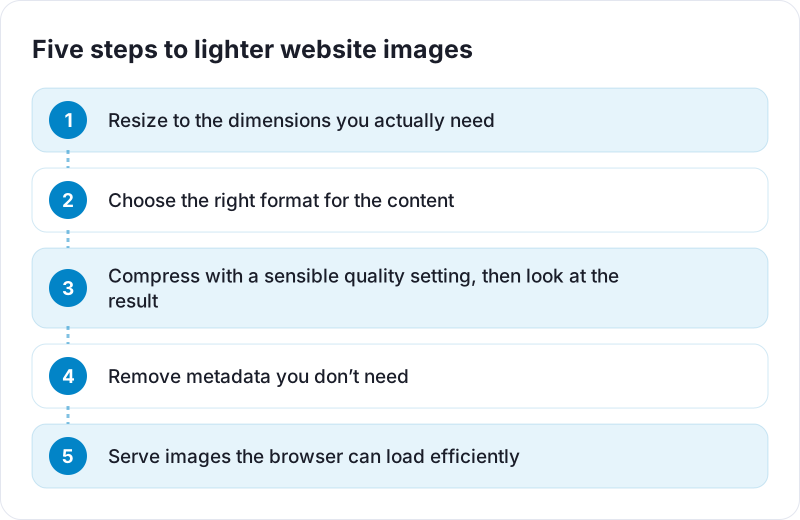
Step 1: Resize to the dimensions you actually need
This is the single biggest win, and it's often skipped. Modern phone cameras produce photos around 4000 pixels wide. If your blog's content column is 800 pixels wide, the browser downloads the full image and then shrinks it on screen, wasting most of the data.
A useful rule of thumb:
- Find the largest width the image is displayed at on your site, in CSS pixels.
- Multiply by 2 to cover high-density ("Retina") screens.
- Resize the image to that width.
For an 800-pixel column, that means an image about 1600 pixels wide. Going from a 4032×3024 photo to 1600×1200 cuts the pixel count by more than six times, before any compression settings come into play.
The Resize Image tool on PDF Planet does this in your browser. Keep the aspect ratio locked when you resize so nothing gets stretched.
Common target widths
| Use | Suggested width |
|---|---|
| Full-width hero image | 1920 to 2560 px |
| Blog or article content image | 1200 to 1600 px |
| Product thumbnail in a grid | 400 to 800 px |
| Small avatar or icon | 2× its displayed size |
These are starting points, not rules. Base the number on your own layout.
Step 2: Choose the right format
- Photos: JPG or lossy WebP.
- Logos, icons, screenshots, diagrams: PNG, lossless WebP, or ideally SVG for simple logos and icons, since vector graphics stay sharp at any size.
- Anything needing transparency: PNG or WebP, never JPG.
WebP is supported by all current major browsers and usually produces smaller files than JPG or PNG at similar quality. You can convert existing images with JPG to WebP or PNG to WebP. For a deeper look at how these formats differ, read PNG vs JPG vs WebP.
A common mistake is saving photos as PNG. A photo stored losslessly can easily be several times larger than a good JPG or WebP with no visible difference on screen.
Step 3: Compress with a quality setting, then look
Lossy formats let you choose a quality level. There is no magic number that suits every image, but a few principles hold:
- Quality settings are not percentages of anything. "80" in one program isn't identical to "80" in another.
- File size drops steeply as you move down from maximum quality, while visible quality changes very little at first. Past a certain point, artifacts suddenly become obvious.
- Busy, detailed images hide compression better than smooth gradients, skies, and skin tones.
So compress, then actually look at the result at its real display size. If you can't see a difference from the original, try a bit lower. When you start to see blockiness, smudged edges, or banding in gradients, step back up. The Compress Image tool runs in your browser, so you can try a few settings and compare the results quickly without uploading anything.
Step 4: Remove unnecessary metadata
Camera photos carry metadata: camera model, lens, settings, and sometimes GPS location. It's usually a small part of the file, but it adds bytes to every download and can reveal where a photo was taken. Many compression and conversion tools drop most of it when they re-encode an image. If location privacy matters, confirm the final file doesn't contain it before publishing.
Step 5: Serve images the browser can load efficiently
Optimizing the file is only half the job. How you put it on the page matters too.
Always set width and height
<img src="garden-1600.webp" width="1600" height="1200" alt="Raised vegetable beds in a small back garden">
The width and height attributes let the browser calculate the aspect ratio before the image loads, which prevents layout shift. Your CSS can still make the image responsive with max-width: 100%; height: auto;.
Offer multiple sizes with srcset
<img src="garden-1600.webp"
     srcset="garden-800.webp 800w, garden-1600.webp 1600w"
     sizes="(max-width: 840px) 100vw, 800px"
     width="1600" height="1200" alt="Raised vegetable beds in a small back garden">
A phone will pick the smaller file and a large high-density screen the bigger one.
Lazy-load below the fold, not above it
Adding loading="lazy" to images further down the page means they only load as the visitor scrolls near them. Don't lazy-load the main image at the top of the page, since that will delay LCP. For that image you can add fetchpriority="high" to tell the browser it's important.
A quick checklist
- Resize to about twice the displayed width.
- Use JPG or WebP for photos, PNG, WebP, or SVG for graphics.
- Compress, then check by eye at actual size.
- Remove metadata you don't want to publish.
- Add
width,height, and meaningfulalttext. - Lazy-load images below the fold; prioritize the main one.
Run through this for every new image and you'll avoid most image-related performance problems before they start. Free tools like Google's PageSpeed Insights or the Lighthouse panel in Chrome's developer tools will flag any oversized images you've missed.
 Image Resolution and DPI Explained
 What Is HEIC and How Do You Convert It to JPG or PNG?
 PNG vs JPG vs WebP and When to Use Each Format